Bon Charge
Background
Ready for a change, Bon Charge was seeking a brand overhaul and site optimisations. Their current branding wasn't speaking to the audience, and users had trouble finding a product fit to their needs.
Approach
The project started off with an audit of the site and an empathy mapping workshop to get to know the users. With the target audience and business goals in mind, I designed two visual directions for the brand.
Once we rolled out the new look and feel to the site, 5 users were recruited to compare the old and new sites. Key factors included trust, product understanding, and usability.
Impact
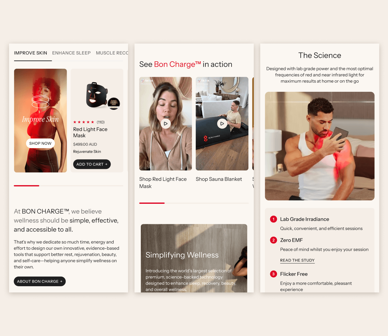
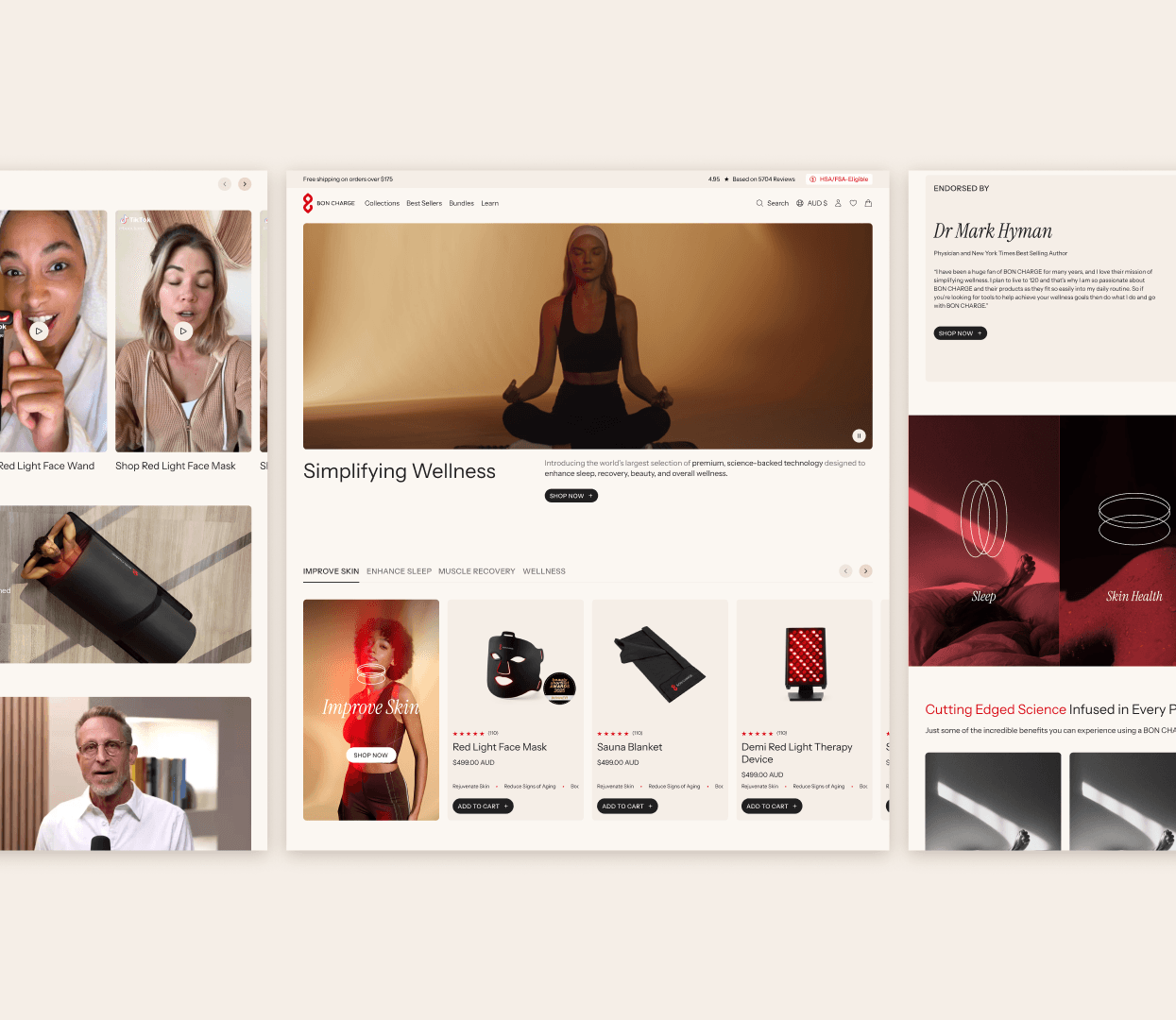
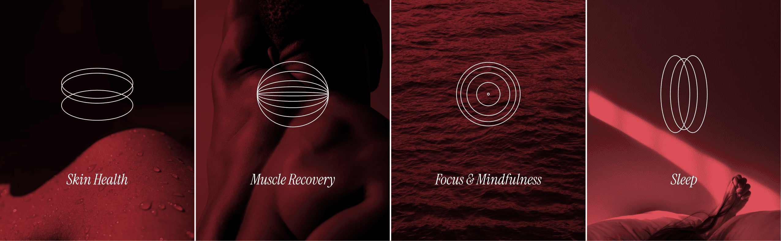
The new brand direction features a warm, inviting colour palette, a modern type pairing, whist bringing the Bon Charge energy. Compared against the old site, users noted improvements across brand impression, trust, product understanding, and usability. Areas for improvement were highlighted which allowed us to strategise future updates to the site.
UX Design
Moderated Usability Testing
Synthesis